In what ways does your media product use, develop or challenge forms and conventions of real media products?
My credits at the beginning of the film were
something I thought about very carefully. I researched good ways to name a production company which reflect the spirit of the organisation. 'Cosmos Pictures' gives the impression of a worldwide institution that is very powerful. The background is moving stars to compliment the 'Cosmos' name.
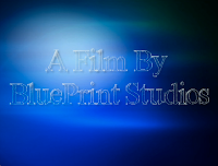
In the research I did of chick flick films I found there were many companies involved in making a movie, and I wanted to reflect this in my own film opening. The idea of 'BluePrint Studios' represents the foundations of a film, indicating that my company is involved right from the planning stage with control and an overview of the whole process.
I chose the name 'Flare Productions' to represent a firey, exciting element to chick flicks. It may indicate sparks and the impression that the company is inventive and has initiative. I chose the colour pink because that is the iconic colour of the chick flick genre and a white outline to make it stand out against the black background. The font is upbeat and bubbly to represent the character of the film.
This opening shot is to set the beginning of the narrative, but it also shows how chick flicks include up-to-date media and relevant technology to reflect the lifestyles of the teenage characters. My research shows that the use of these technological props is typical in chick flick films. The other props in the background are also very 'girly' and the 'Links of London' brand name shows a very glamorous
side to the character.
In my research, chick flicks have used medium close-up shots to introduce the characters, showing both facial expression for feelings, and body language. These next two shots represent contrasting body language and feelings, one being shocked and one being relaxed. I wanted to introduce my characters with a side of their personality showing and I think this technique is effective.
I have included the names of my principal actors in these opening shots because my research has found that chick flicks do tend to spread the actors' credits throughout the beginning of the film.
Many chick flick films begin with the characters starting their daily routines, so I chose the mise en scene with the characters' bedrooms and their costumes reflect their personalities. In this shot, my character is in cuddly, funny pyjamas, which connote a relaxed, informal, perhaps slightly messy and childish personality.
The shots of the two characters getting ready are cross-cut to juxtapose the differences in their personality and attitude. This close-up, which I have noticed in many chick flicks, is very clean and precise, just like my character.
The setting and location was in the actors' actual bedrooms so that they would feel the most comfortable and natural. This made sure that the mise en scene creates verisimilitude because I did not use a set.
I did not use any special effects in my film opening because this is not often seen in chick flick films. Instead, I focused on the characters and their actions.
I didn't put my film title at he beginning of my film, but used a convention I've seen in many other chick flicks by introducing my characters first. I called it 'Same Difference' because this reflects the core theme of the film which is about clash and conflict. The colour of my film title is again pink to match the production company's credit, this shows the girly powerful side of the film.


No comments:
Post a Comment